سلام
نمودارها انواع مختلف دارن. یک مثال ساده را پیدا و خدمتتون ارسال میکنم.
دادهها را در یک فایل متنی مثل txt ذخیره کنین و ازش کپی بگیرین در فایلتون.
یا با ابزارهای خود excel کپی بگیرین که سطر و ستونها بصورت معنادار حفظ بشه.
مثلا بصورت زیر درمیاد:
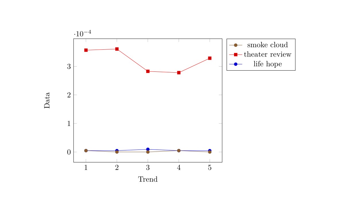
a,       life hope,     theater review,     smoke cloud
1,       0.000004824,   0.00035694,         0.000004824
2,       0.000004687,   0.000360903,        0
3,       0.000009425,   0.000282764,        0
4,       0.000004794,   0.000278048,        0.000004794
5,       0.000004565,   0.000328691,        0
بعدش اونا رو بیارین در فایل TeX بصورت زیر بذارین.
\documentclass{article}
\usepackage{pgfplots}
\usepackage{filecontents}
\begin{filecontents*}{mydata.csv}
a,       life hope,     theater review,     smoke cloud
1,       0.000004824,   0.00035694,         0.000004824
2,       0.000004687,   0.000360903,        0
3,       0.000009425,   0.000282764,        0
4,       0.000004794,   0.000278048,        0.000004794
5,       0.000004565,   0.000328691,        0
\end{filecontents*}

\begin{document}
\begin{tikzpicture}
\begin{axis}[legend entries={life hope, theater review, smoke cloud},
%legend style={
%at={(0.5,-0.2)},
%anchor=north,
%legend columns=1,
%cells={anchor=west},
%font=\footnotesize,
%rounded corners=2pt,
%},
reverse legend, legend pos=outer north east,xlabel=Trend,
    ylabel=Data]
\addplot table [x=a, y=life hope,, col sep=comma] {mydata.csv};
\addplot table [x=a, y=theater review, col sep=comma] {mydata.csv};
\addplot table [x=a, y=smoke cloud, col sep=comma] {mydata.csv};
\end{axis}
\end{tikzpicture}
\end{document}
خروجی:
موفقتر باشین.

